PRINCESS CRUISES
Excursion Reservations
Modernizing a legacy booking experience and introducing pre-purchase

Overview: The shore excursions web application had aged past its limits. Built on a design that predated the company's mobile ambitions, it was visually dated, difficult to maintain, and only capable of reserving excursions — not purchasing them. I led the redesign as the sole designer, refreshing the visual design, rebuilding the experience mobile-first, and working through a genuinely complex product challenge to introduce pre-payment for the first time.
The redesign shipped, improved conversion, reduced bounce rate, and produced a component library that became the foundation for other web applications across the company.
The Situation
The excursions application was doing one thing: letting guests reserve shore excursions. There was no way to pay for them online in advance. For a company with guests booking from across the globe, this was a meaningful gap both in guest experience and in business capability.
At the same time, the existing application was showing its age. The visual design was outdated, the mobile experience was virtually unusable, and the codebase had grown difficult to maintain and extend.
Opportunity: Both modernizing the experience and unlocking pre-payment, would turn a read-only reservation tool into a true e-commerce flow and help move excursion reservations into the first wallet, freeing up more room in the guest's second wallet later.
Project TEAM: I was the sole designer on the project, working alongside a product owner, UX researcher, engineers, a business analyst, and the Excursions team.
My Responsibilities: Product design, information architecture, interaction design, prototyping, competitive analysis, design system, component library, and handoff specs for development.

Research & Discovery
I approached discovery from multiple angles. A competitive analysis looked at how other cruise lines and travel platforms handled excursion browsing and purchase, as well as how e-commerce more broadly managed cart behavior, credits, and multi-item checkout. Stakeholder interviews surfaced the business requirements and surfaced the technical constraints early, which proved critical. Analytics identified where guests were dropping off in the existing flow, and user research gave us direct insight into what was frustrating or confusing about the current experience. Two constraints emerged that would shape the entire design:
The reservation system predated the web. The backend had been built for trained agents taking reservations over the phone — not for self-service online shopping. This created a fundamental problem for the cart experience, and understanding it early meant I could start thinking about solutions before design had even begun.
Legacy content and assets. Photography and supporting content varied significantly in quality across excursion types, creating inconsistency that no amount of good layout could fully mask.
Design
The redesign addressed the goals of modernizing the visual design, rebuilding for mobile, and introducing pre-payment.
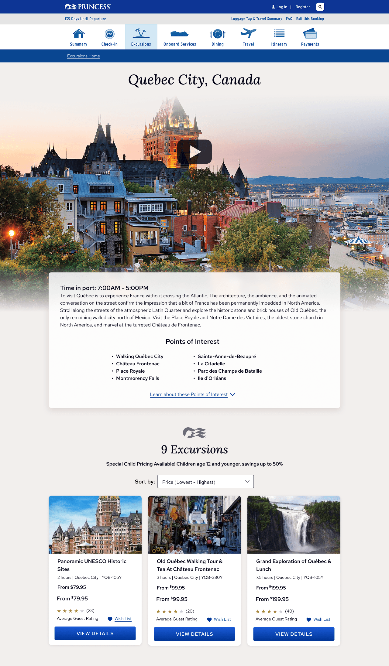
Visual and structural modernization was grounded in a mobile-first approach from the start. Rather than designing for desktop and adapting down, the new layouts were conceived for small screens and expanded up. This approach forced cleaner hierarchy and better content prioritization at every level. Accessibility improvements were built in throughout, not retrofitted at the end.
A component library built in Sketch brought consistency to the redesign and significantly accelerated the work. More significantly, the components designed for this application were architected to be reusable and they were subsequently adopted as the foundation for other web applications across the company. What started as a project-level efficiency became an organizational asset.


Action
Solving the Cart Problem: Introducing pre-payment required solving a problem that had no existing solution in the company's infrastructure.
The reservation system had been built in an era before e-commerce. For it, an excursion was binary, available or reserved. There was no concept of a cart and no way to hold an item while a guest continued shopping without either reserving it or leaving it fully available to others.
I proposed a workaround that when a guest added an excursion to their cart, we would create the reservation immediately. This removed the excursion from inventory, preventing it from being sold to another guest while the first was still deciding. An automated overnight batch process would then cancel any reservations that remained unpaid and return those excursions to inventory.
The tradeoff was real. Excursions would be out of inventory for part of a day, and guests couldn't hold items in their cart for more than 24 hours. But it made the feature possible without a fundamental change to the reservation system that would be costly and take more time than available, and it protected guests from the worst outcome of having an excursion sell out from under them mid-checkout. Engineering confirmed the batch process was feasible, and after working through timing concerns for our global guest base — guests in Eastern Asia and Australia meant there was no truly quiet window — we landed on an approach that minimized disruption. Post-launch, we received no complaints related to the overnight cancellation behavior.
Solving the Credits Problem: A second constraint proved the harder design challenge.
The payment system could apply a payment or credit toward a category of service, excursions in this case. But had no mechanism to apply it to a specific excursion within a multi-item order. When a guest was reserving multiple excursions, there was no clean way to show them exactly how their payments or credits would be allocated.
The solution was a per-guest accounting summary. A structured breakdown of charges, applied payments, any available and applied credits, and any remaining balance for each guest on the booking. It wasn't elegant in the way a purpose-built payment system would allow, but it was transparent, accurate, and followable, as validated through user testing. Guests could see exactly where their money and credits were going.
This was the most challenging design problem on the project. The guest experience was constrained by infrastructure that couldn't be changed on this timeline. The goal became making something honest and clear rather than something that obscured the complexity — and user testing confirmed that guests could navigate it successfully.

Results
The redesign shipped in full. Conversion improved, engagement increased, and bounce rate dropped. Guest feedback on the new experience was positive, particularly on mobile.
The component library built for this project outlasted it and was adopted across multiple other web applications at the company establishing a shared design language that improved consistency and reduced redundant design work going forward.
The pre-payment feature launched without the inventory or cart issues we had anticipated, and the overnight batch process ran without generating guest-facing complaints despite the global user base.Being able to pay ahead was surprisingly popular with guests, and eventually the system was changed to require payment at the time of making a reservation.
Learnings
The most important lesson from this project was about engaging with technical constraints early and creatively. The overnight batch solution wasn't in any design playbook, it came from understanding the system deeply enough to find the seam where a workaround was possible. That kind of thinking requires designers to be genuinely curious about how the backend works, not just what the frontend needs to do.
The credits accounting summary was a reminder that sometimes the best design outcome under real constraints is clarity, not elegance. When the system can't do what you'd ideally want, the honest move is to surface the complexity in a way users can understand, not to paper over it with design that creates false confidence.
Both solutions worked. Neither was the version I would have designed with a clean slate. But that's often how it goes.